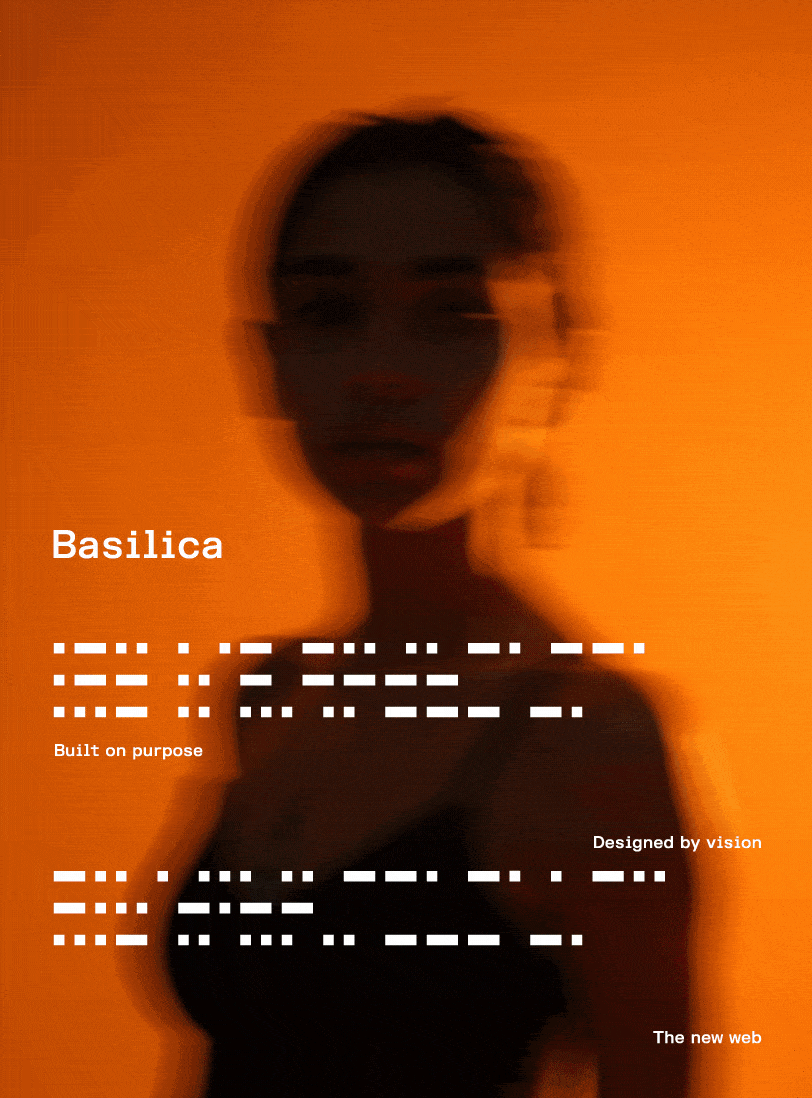
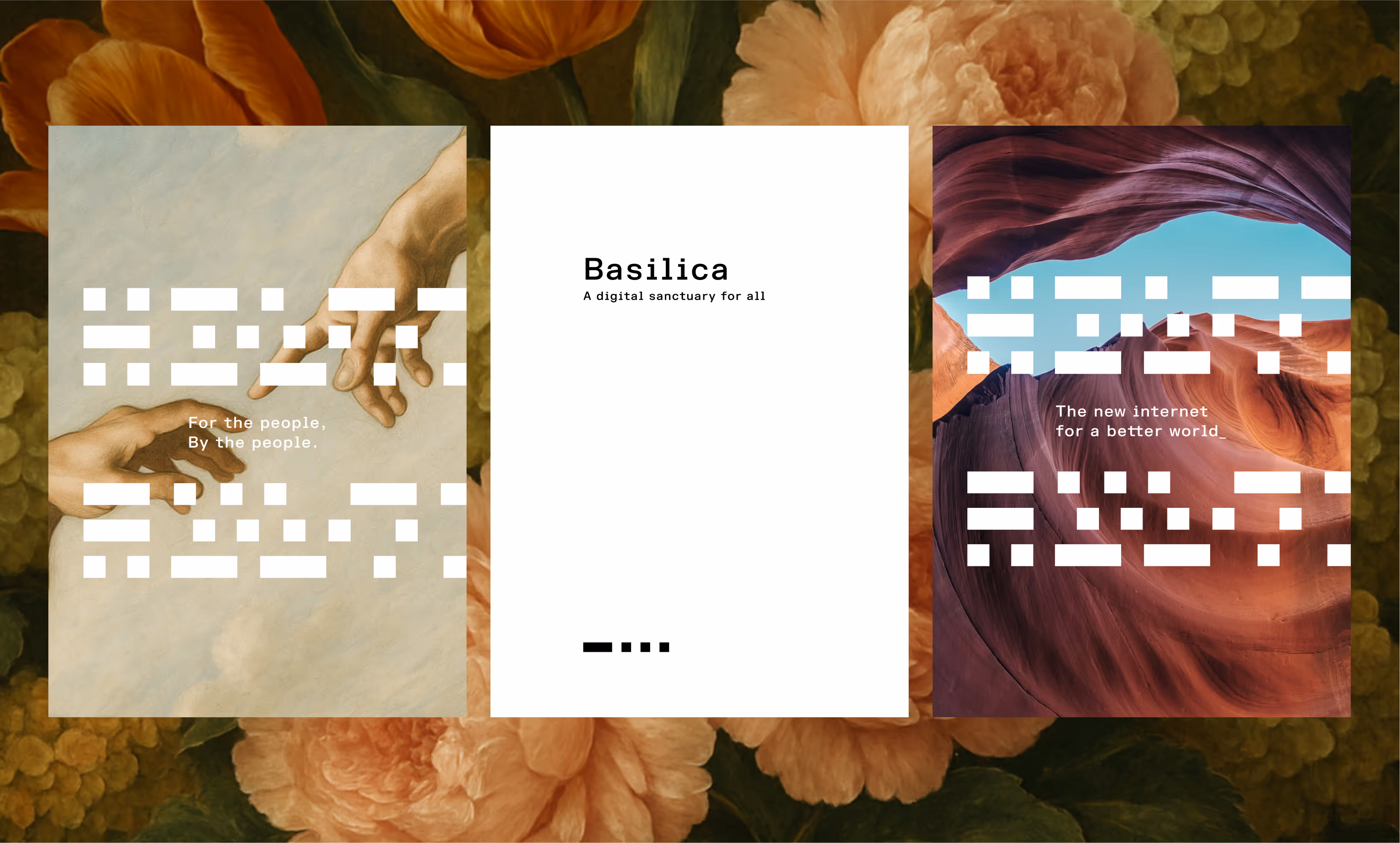
A brand that is redefining the web’s infrastructure through revolutionary mathematical beauty.
Basilica is still in stealth mode. While we cannot share details about the product itself, many of the concepts behind the brand identity are deeply connected to the product vision. Out of respect for the NDA, this case study focuses solely on the brand and identity design work we created to represent Basilica.
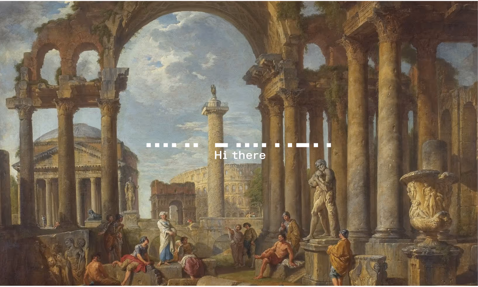
The name Basilica draws from ancient Roman architecture — rectangular halls built on strong columns and foundations, designed to endure as centers for business, law, and community gathering.
At its core, Basilica is about building a new kind of internet — one that stands on strong geometric foundations, architecture and culture—creating digital pillars that support global connection, reimagined for the modern age.
What we did
— Brand Strategy
— Visual identity
— Sound Identity
A rare chance to define a revolutionary brand from the ground up.
Basilica is building a revolutionary product that challenges how people experience the internet. As the company prepared to emerge from stealth mode, they needed a brand identity as bold and foundational as their product vision — something that could carry the weight of their ambitious vision while establishing immediate global recognition.
This presented a unique challenge: create a brand system for a product that justifies its revolutionary nature. As a product still in stealth mode, the product details remain confidential, but the brand needed an identity as powerful and forward-thinking as its vision. The identity had to work across cultures and languages from day one, be instantly recognizable, and feel both timeless and cutting-edge. The opportunity was to design a brand that wasn’t just seen, but experienced — visually, sonically, and emotionally.
Diving deep into the digital communication system and its deep rooted connection with fractal geometry
What captivated us about basilicas was their fractal geometric foundation. These structures demonstrate how mathematical principles create lasting strength, permenance and visual harmony. This same instinct for geometric thinking appears across human cultures - from fractal patterns in African village layouts to the Divination systems which the diviner "decodes" to interpret messages about the spiritual or material world - the foundation for the binary system in the modern age.
We recognized that geometry itself is humanity’s first universal language — appearing independently across cultures and now is the foundation for how digital information transfers from one point to another.
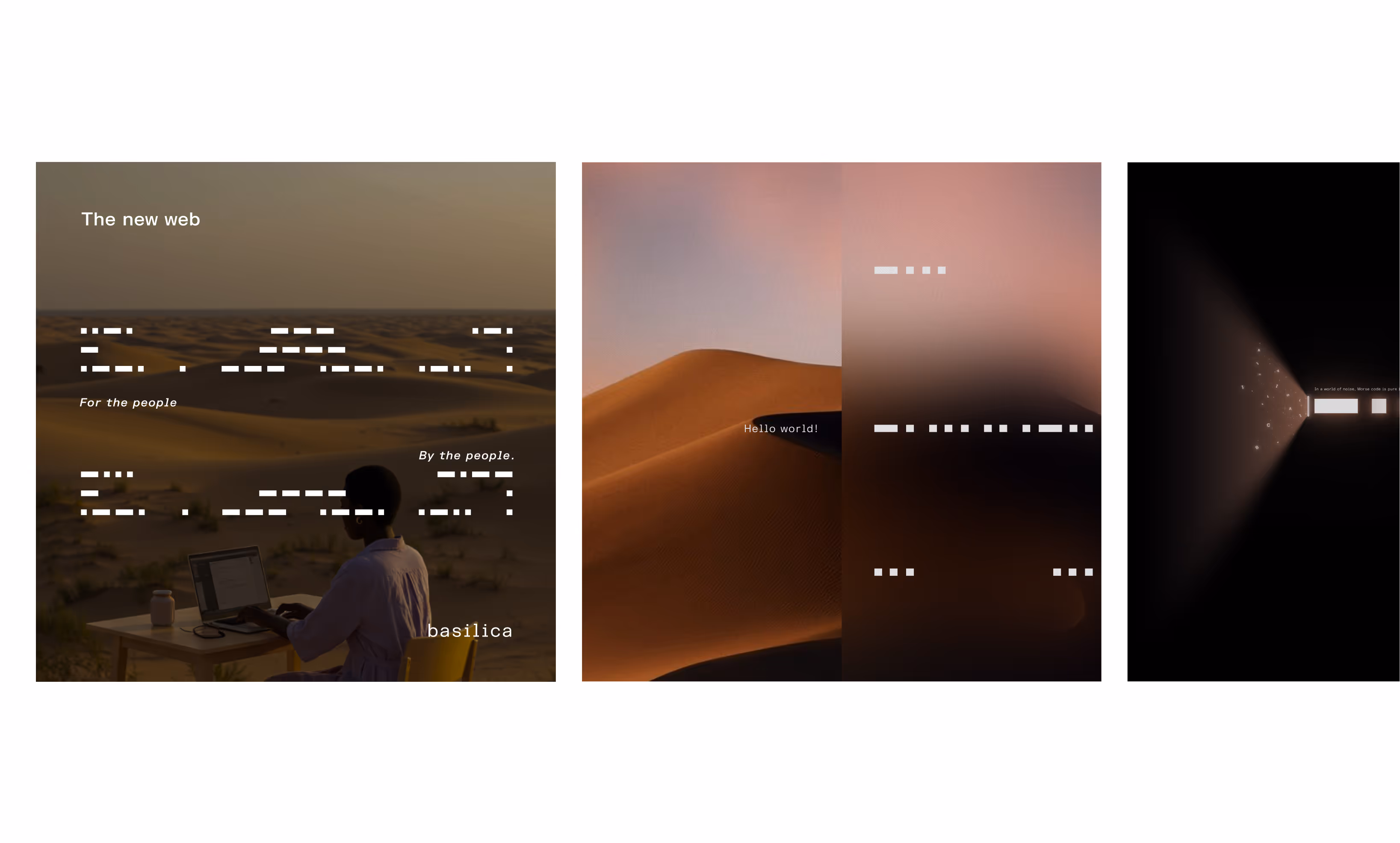
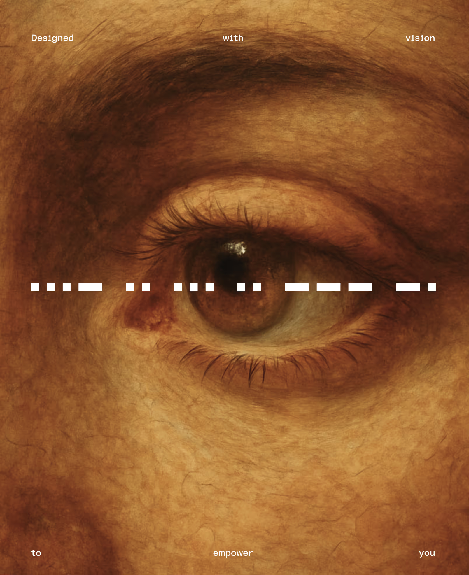
From this fractal geometric foundation emerged our core design language: Morse Code.
— Brand Strategy
— Visual Identity System
— Sound Identity Design
— Typographical System
— Art Direction
— Brand Guidelines
Transforming communication into a living identity.
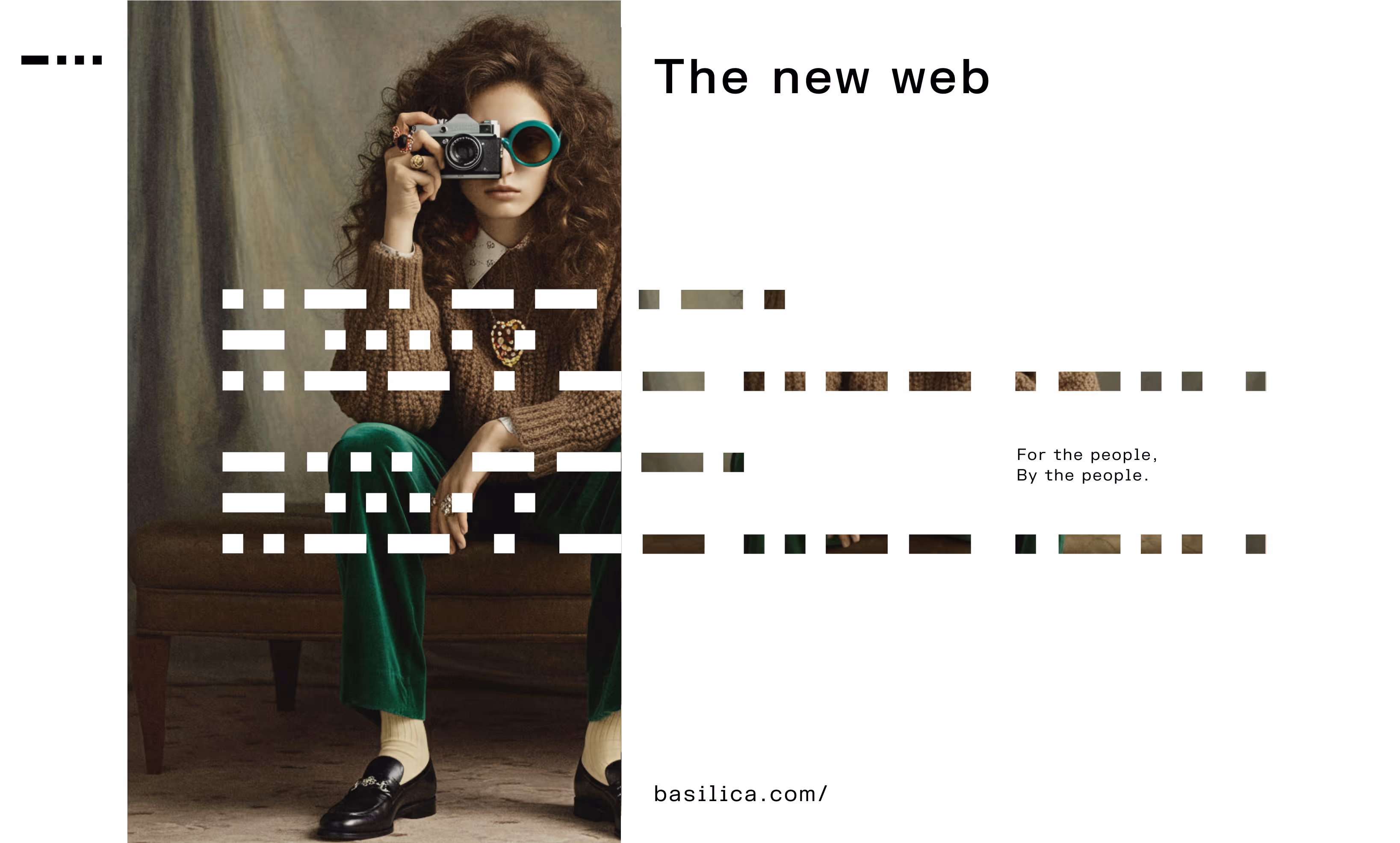
Basilica’s strategy was about creating a brand that could carry its revolutionary vision forward. By interpreting Morse Code as typography, we unlocked an adaptable system capable of endless variation in alignment, spacing, and rhythm — a living language for the brand. Recognizing that nothing in the world is truly static, we designed the logo to be continuously in motion, reflecting the dynamic nature of the internet, culture, and human interaction. The goal was to build a brand system where motion, sound, and visuals all emerged naturally from its core vision, rather than being applied as afterthoughts.
— Brand Vision
— Brand Idea
Turning geometry into a living identity design
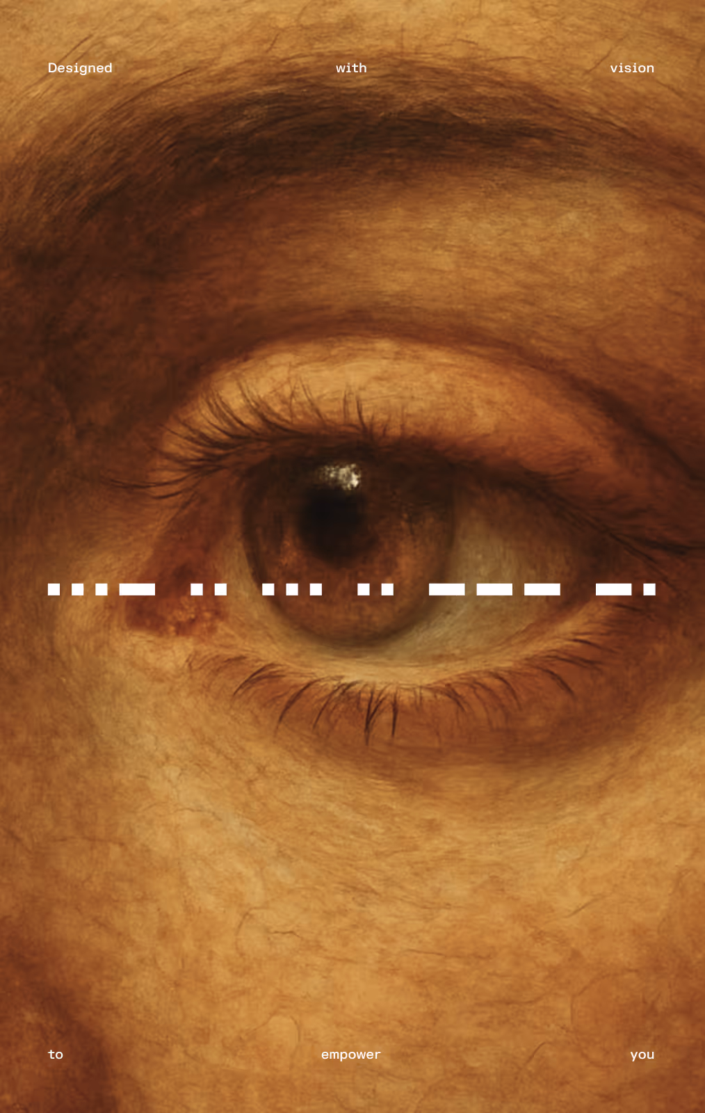
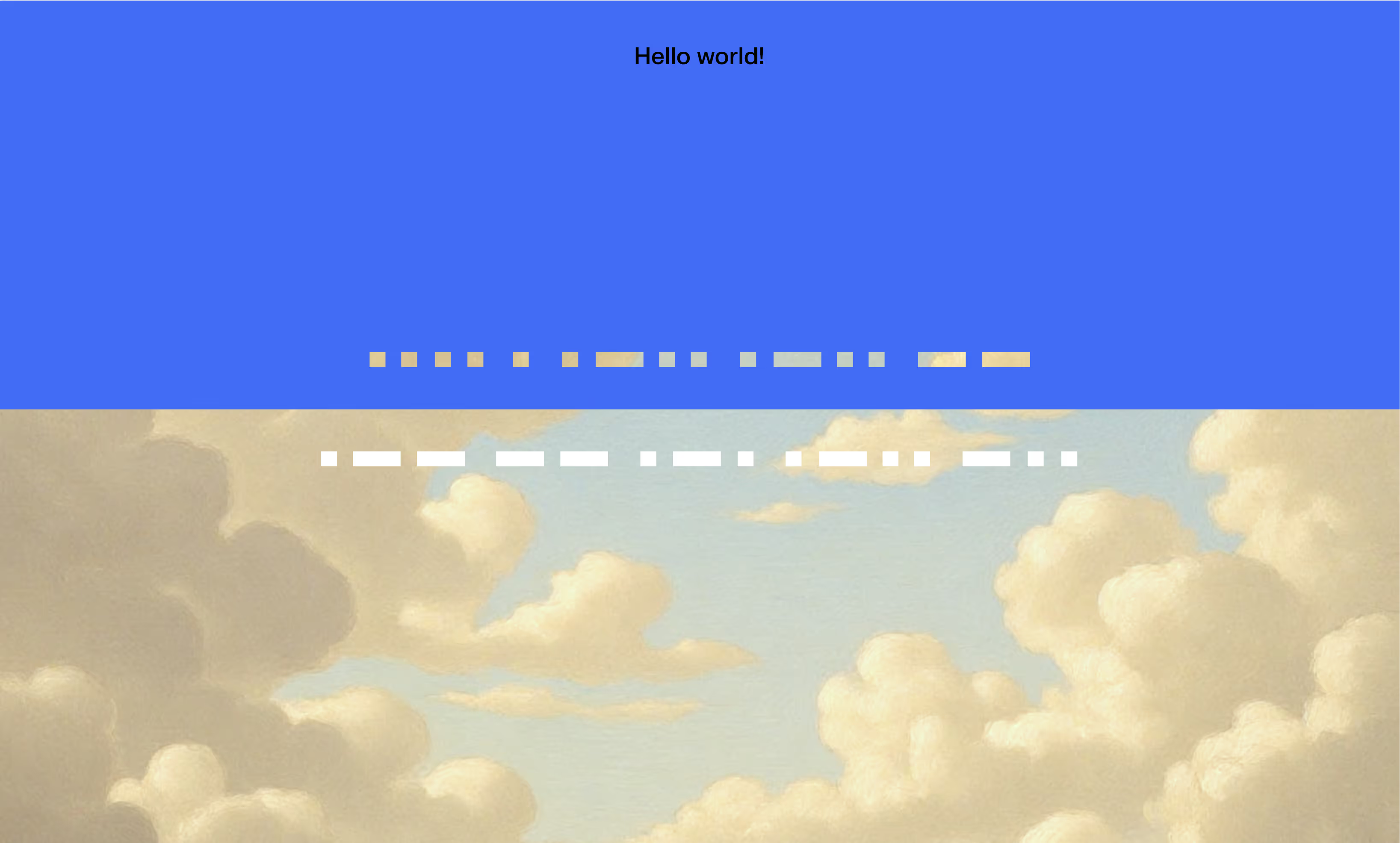
The visual system transforms Morse Code into a design language. A single sentence could produce countless variations simply by adjusting alignment, letter spacing, and paragraph spacing. It creates abstract shape illusion that when looked closer reveals strong brand messages.
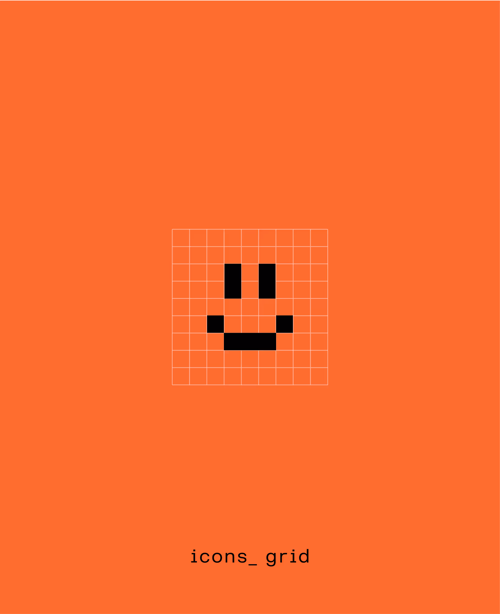
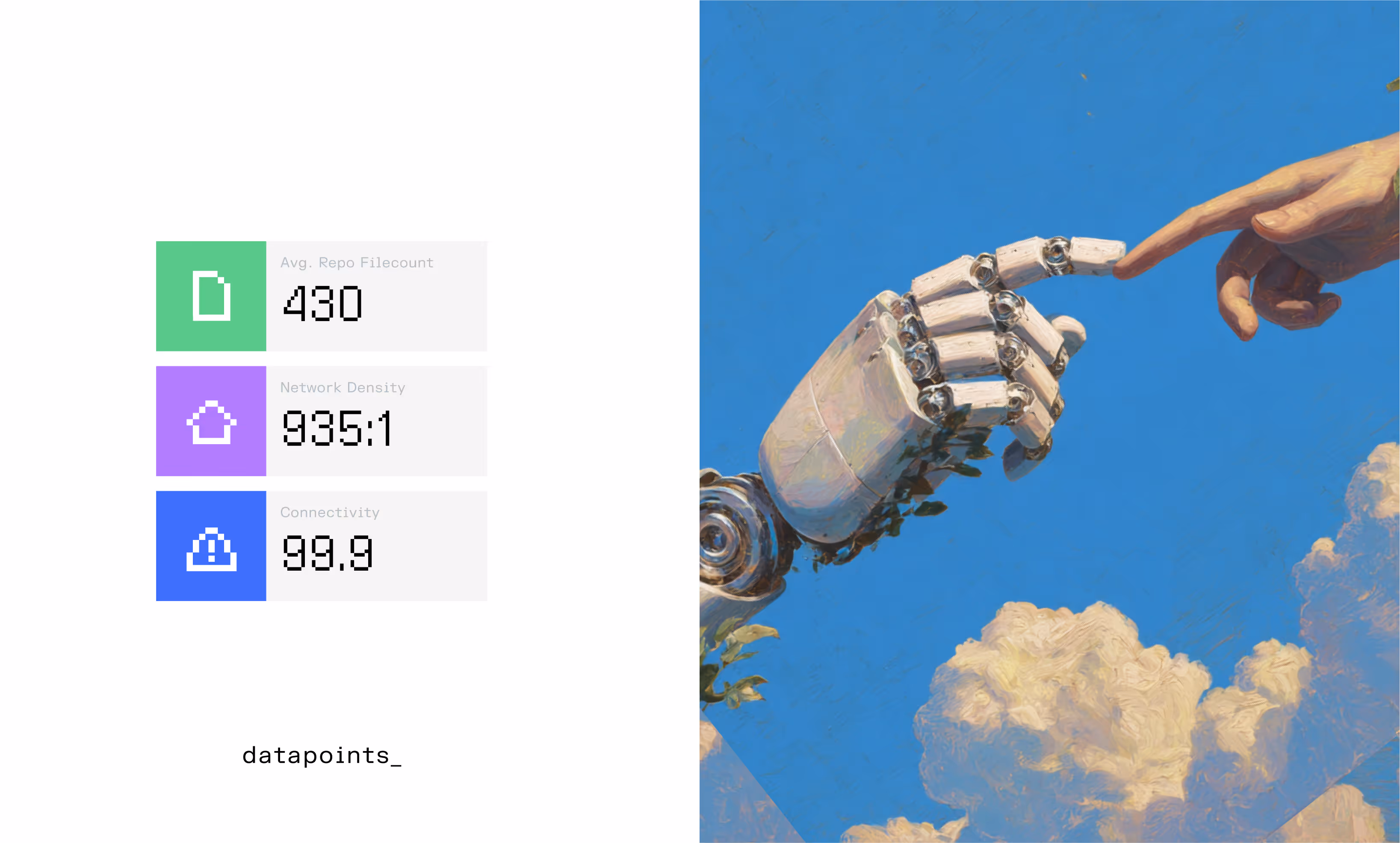
The overall brand is complemented with Mono font for digits and provides inspiration for the icon system as well.
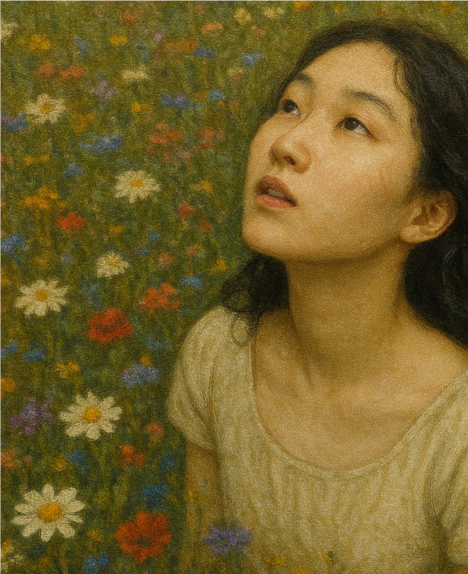
The in-motion logo ensures the brand is never static, visually embodying energy and adaptability. Visual cues borrowed from Renaissance painting give the system a sense of timelessness, grounding the modernity of the brand in historical knowledge and architectural principles.
— Logo Design
— Art Direction
— Typography System
— Colors
— Editorial & Grid System
— Motion Design
— Brand Guidelines
— AI Generated Photo Library

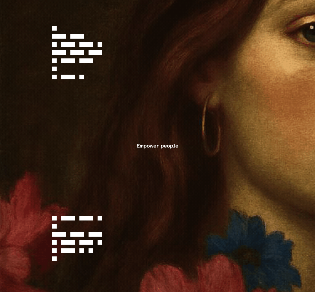

An example of how a same message can create different visuals by adjusting the typesetting.
A signature audio identity that speaks for itself.
A carefully thought-out sound was designed that builds a strong bond between a brand and its customer. Working closely with sound engineers and musicians, we translated the rhythmic patterns of Morse Code into a unique audio mark.
Like Netflix’s iconic sound, Basilica’s sound identity is instantly recognizable, exclusive to the brand, and consistently reinforces its presence across channels. The sound system is an integral part of the brand’s vision, making Basilica both seen and heard in a way that is dynamic, inclusive, and unmistakably its own.
— Sound Design
— Audio Mark
Our experience working with your team on the Basilica brand was excellent. The iteration cycle was productive and collaborative - we looked forward to discussing each new concept and planning the next steps.
Deztopia’s creative approach and understanding of the bigger picture were particularly impressive, and the resulting branding exceeded our expectations.