Foley Services
Overhaul Foley’s experience to design for the future, improve discoverability and optimise for user needs.
Foley is a leading provider of DOT (Department of Transportation) compliance services for transportation and employment industries. They partner with motor carriers, employers and staffing firms to manage their compliance, invoicing and background screening programs.
In 2019, Foley services decided to overhaul their entire design language from website to dashboards to marketing collateral. We helped Foley to envision their ideas and enter in 2020 with a new look and feel.
Our Role
We led the redesign of the website, product design, and marketing collateral including but not limited to creative direction, ideation, strategy, user journey mapping, information architecture design, wireframing, visual and communication design.

The Problem
Foley's design language had not been optimised strategically for the past decade from a user experience perspective. The flow of information architecture and structure failed the user in finding relevant information; creating an unsatisfied and disorienting experience.
Problems in the existing designs
The Solution
This one complex problem required a three-pronged solution.
Improve discoverability
First, we had to make sure that the user had seamless experience with easy access to high quality information, for this a complete redesign of the information architecture was executed.Design for user & business need
Second, we needed to design for the future to cater both, a user-friendly design language and possible future business expansions. For this the design aesthetic was completely overhauled to make it look more compatible with the current aesthetic and adaptable for the future.Cohesive design system
Third and final solution was developing a cohesive design system to ensure consistency in Foley’s design language and brand presence across all platforms available in the market (today and in the future) — which included everything from their website, dashboard, marketing collateral, editorial to all their communication design.

(Top to bottom) Website new design, online guide design, presentation template, website responsive, style guide.
Before diving into design, we had to develop a deep understanding of the users, market and business needs. We started from working closely with different stakeholders and leadership to understand the product and its roadmap plus the value it is adding in the users everyday life. Based on the data collected from research, observations, and product understanding we started designing the dashboard parallel to the website.
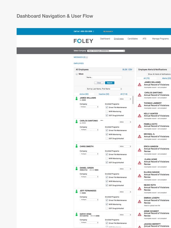
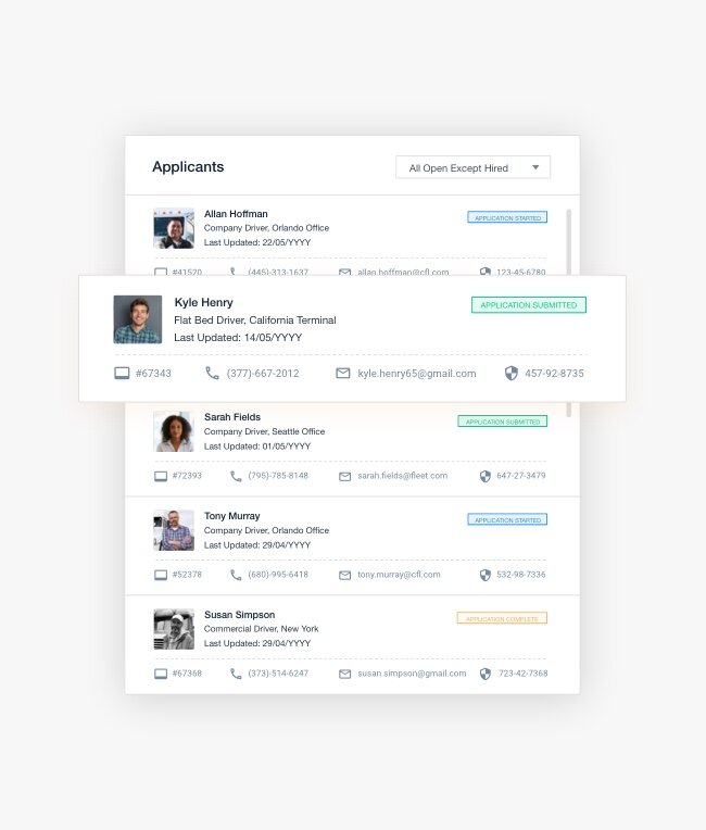
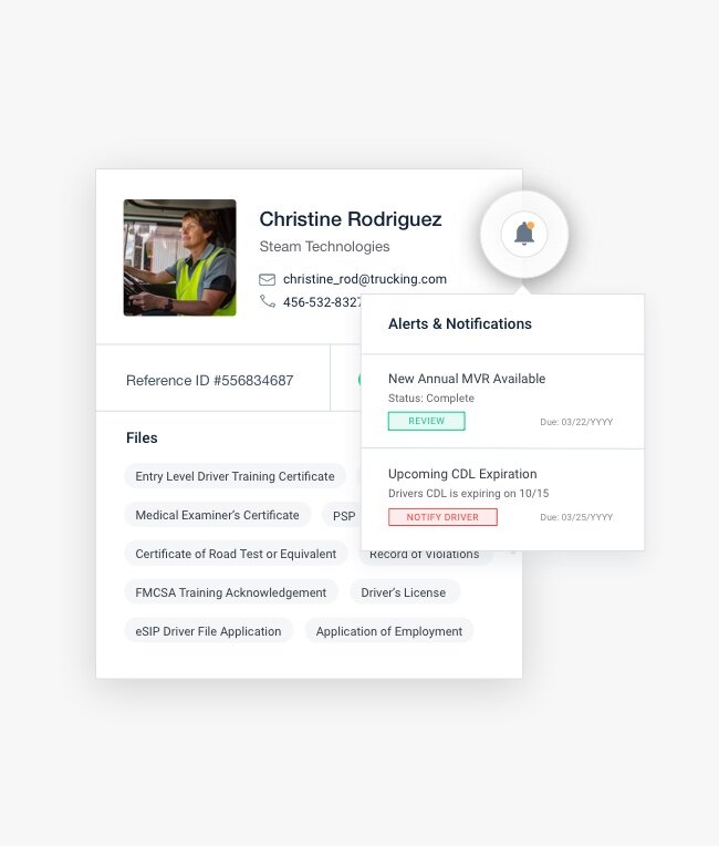
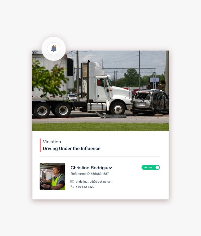
Dashboard Redesign For Improved Discoverability
The main use of the dashboard is to recruit drivers that are compliant with certain laws — Foley’s dashboard is used to track violations of these laws and to evaluate which drivers are good to hire along with the detailed information of the kind of vehicles they possess. The deliverables include clean drug tests of the drivers; their licenses and other documentations required before registering for hiring. Foley helps them achieve and upload these deliverables.

Problems in Old Dashboard Design
Poor information architecture
Inconsistent UX patterns resulting in bad user experience
Confusing and needlessly deep information architecture hierarchy

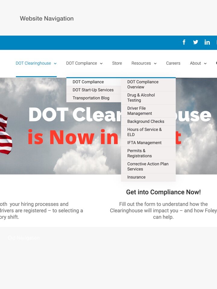
Analysis of Old Navigation

Improved Navigation Design
Solutions Provided in New Design
After studying their Google Analytics to understand the user’s needs plus actions performed during product use, we made user flows to optimise the information and cater to the user’s primary actions. Using this, we were able to restructure the dashboard by arranging information, reducing redundancy, and decluttering the information.
With the new design, we introduced and advocated for simple UX patterns which helped the user by clearing the barriers plus pain points faced in the old design.
We grouped together a lot of content to remove any redundancy and decreased the categories to make it easier for the user to navigate; which also enabled the user to perform tasks faster.


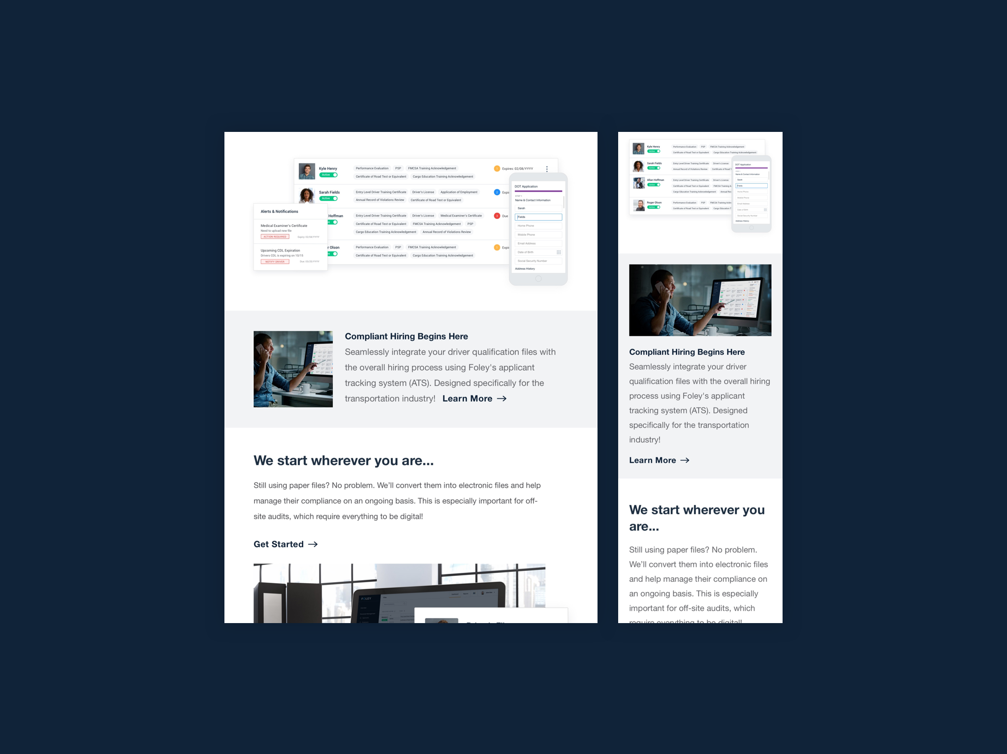
Website Redesign For Foley’s Future
In 2019, Foley was looking at introducing and launching new solutions for their users. With that opportunity in mind, Foley wanted to enhance their web based experience to improve their marketing strategy, user experience plus overall look and feel of the website.

Problems in Old Website Design
In the website’s old navigation system, it was difficult to find a home for new solutions.
There was no room for displaying the product, so there was no way of building prospect confidence and trust in the product.
Foley didn’t have any designers or developers in their team which increased their reaction time, posing a big hindrance in the quality of their services.
In the old website design, there was no place to cater for the educational content that Foley had or was planning to launch in the future.
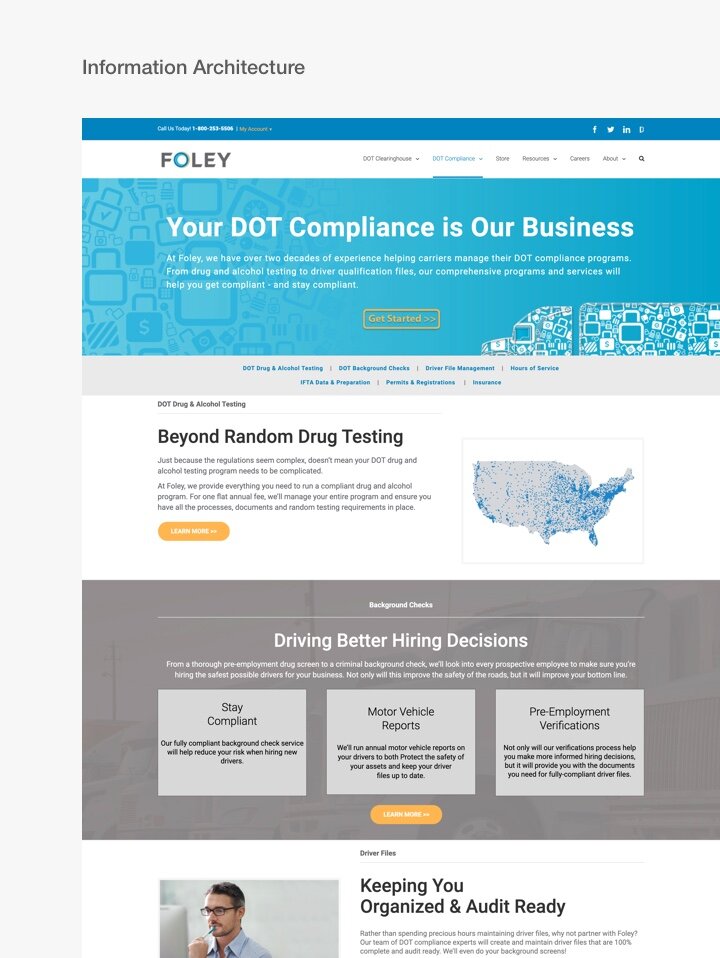
Solutions Provided in New Design
We redesigned the entire navigation to support business expansion and goals.
With the new design, we introduced the products on different pages to gain trust.
We proposed that Foley use WordPress to develop their website and hire developers to make the components more flexible; so they don’t have to hire a new person every time a small change is required. We also designed the website on a components basis, which makes it easy for Foley’s team to make in-house changes.
We also designed and introduced a resource center that catered to all kinds of content.

Old Website Pages. (Homepage, Solution Page: Background Screening Page, Product Page: DOT Clearing House Overview Page)
Old Navigation analysis and the potential improvements of the structure.


Visualising the product UI on website
Components approach for scalability and easy website updates.


Designing a proper ‘Resource Center’ to house all the educational items in one place.


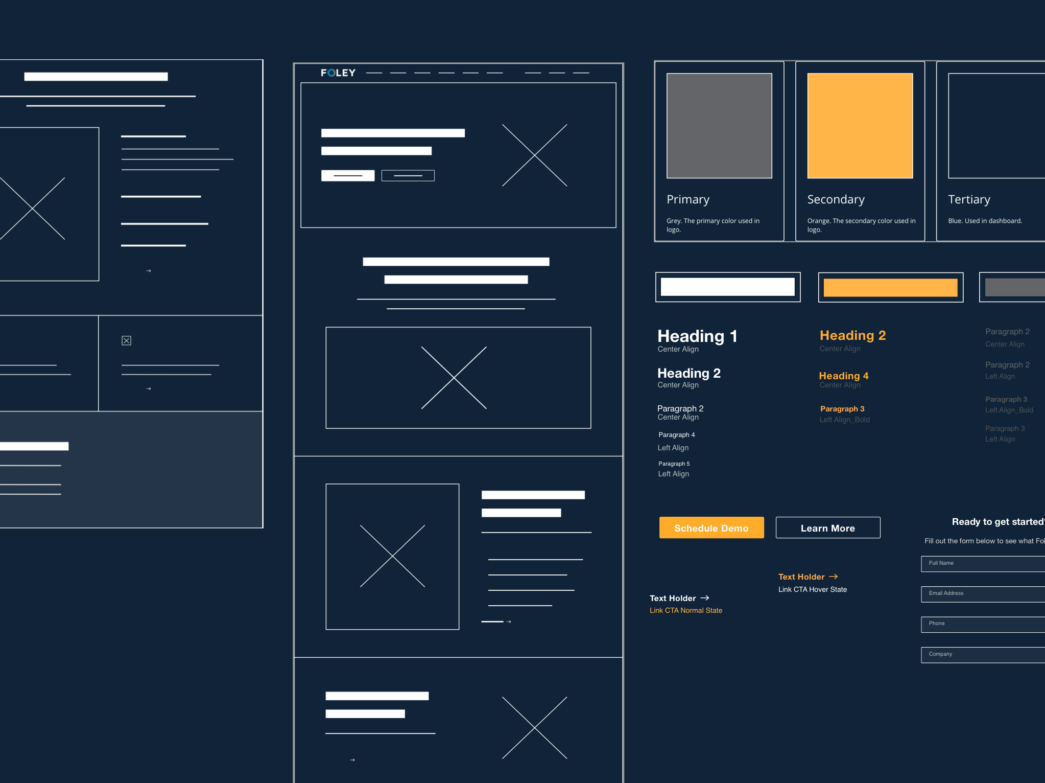
Developing a Cohesive Design System
We created a detailed design system for Foley which solved a lot of their problems with regards to making future changes in the website, dashboard and marketing collateral. This includes the set typography, colour scheme, button designs and much more. Having a comprehensive style guide helps in maintaining the scalability and consistency in future additions and keeping a harmonious look and feel in the design. It helps in reducing the design and development costs for the product and allows small changes to be done in-house.

Marketing Collateral
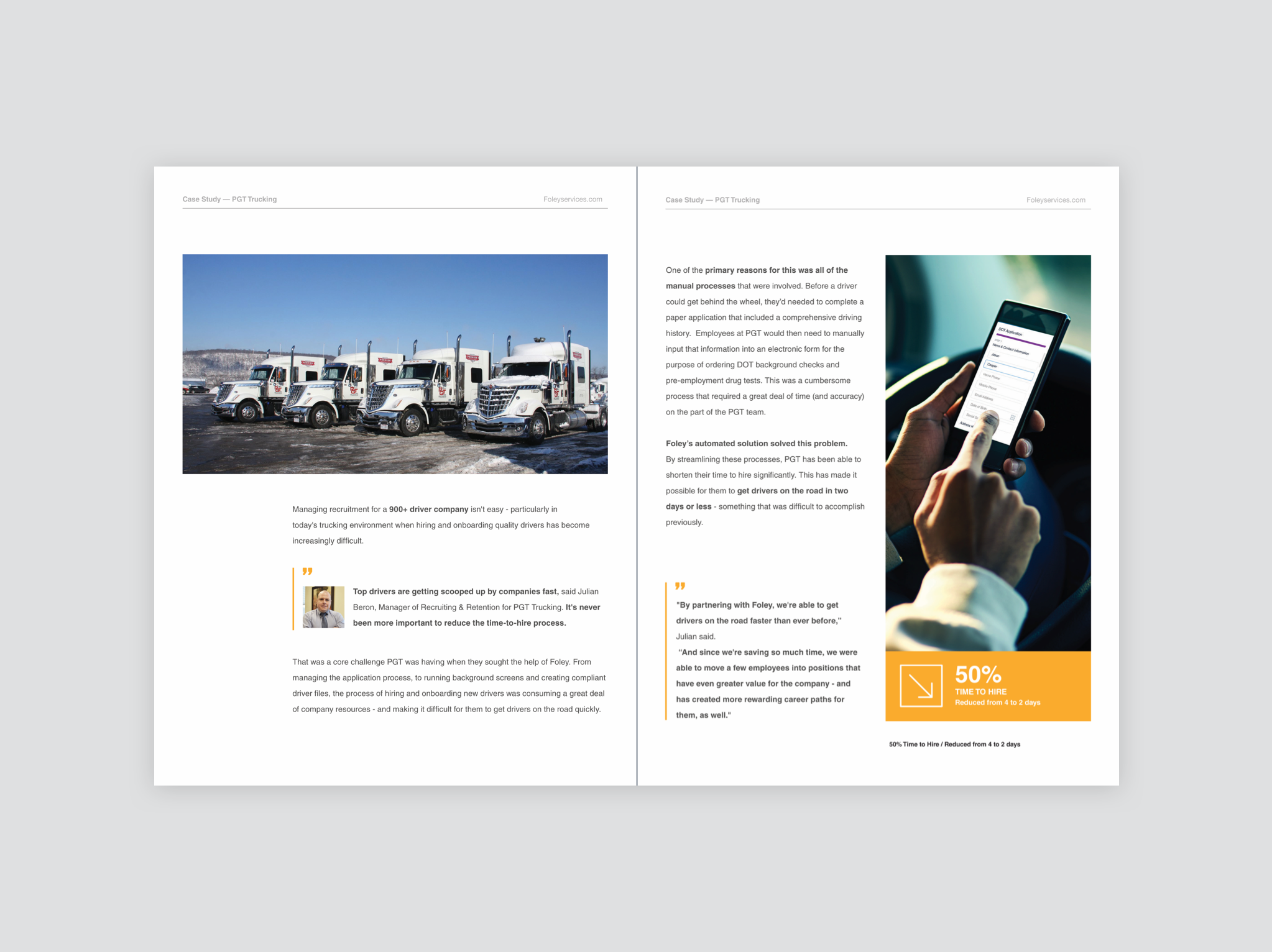
The marketing collateral included everything that came under Foley’s editorial and communication design. In this phase, we designed case studies, infographics, flyers, PDFs and Google Ads for Foley — basically everything their Sales Team required for Sales Enablement. We also templatized all of these items in the Style Guide to achieve consistency in the current overall redesign as well as to make it easy for them to maintain in the future.

Takeaways from the Project
1. It’s important to set your goals in advance. Setting realistic, achievable and time-bound goals with the stakeholders at the very beginning, will serve as a guiding light for your entire project.
2. One should not be afraid to redesign. Testing out different directions in the beginning, getting feedback and then remodelling accordingly, is a great way to find out exactly what your client wants.
3. Always keep the users and usability in mind. Each design is created for its users; therefore a design’s usability is its most valuable feature. Step into the users’ shoes to first identify all the hurdles they face in collecting data and then solve them.
4. Effective communication is crucial. Transparent communication with the stakeholders helps in building their trust plus getting a better understanding of their expectations and meeting those, will lead to a project’s success.
5. Make a marketable design. The best designs are not just user friendly; they are also the ones to bring in more business. Aligning your design solutions with the client’s business goals is an essential part of the project without which your design is incomplete.
“
Team Deztopia are the most talented creative professionals I have ever had the pleasure of working with. Their skillset is very diverse from Website Design to Infographic and User Interface Development to User Experience Design, making them a one stop shop for all of your company’s design needs. Most importantly, they have a consultative approach where they go beyond the design task at hand and seek to understand your industry as well as its unique business needs. The end result is a target and creative solution that is sure to appeal to your prospect and customer base.
— Tim Sala
Director, Marketing and Communications at Foley